Brand Interview: Michael DiFeo, Artist
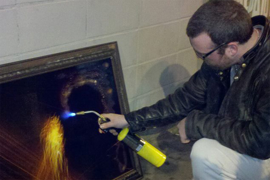
Michael DiFeo charring the surface of “Toasted Fireball” at his solo show at the short-lived SOYES café on Westside Ave. in Jersey City.
How long has your company been in business? Please tell us a bit about your company, its mission, it’s goals…
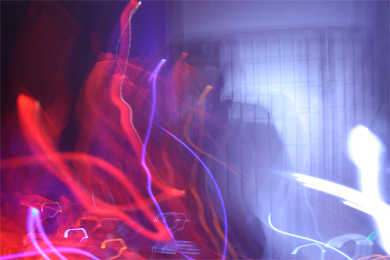
I studied photography in college and have been showing for about four years. I mostly shoot abstractions called camera paintings. In a camera painting, you move the camera while the shutter is open to create the image. I use different kinds of gestural movements to create my works. I love the participatory aspect intertwined with composing these images. All my work is shot in-camera, I don’t use photoshop to create my work.
In the last few years I’ve begun painting on top of my prints with a translucent acrylic. I think this adds another dimension to the work and I feel it also combats the disposability of photographic prints. I’ve also moved in the direction of mixed media by charring and building frames.
An immediate goal of mine is to finish my undergrad degree. In the long term, I want to get my MFA.
“143 Revelry” from Michael’s residency at the Waterbug Hotel.
Do you donate to charities? Tell us about that also and why.
I donated a piece that was auctioned to help pay for a friend’s brother’s health care. I was there performing some music and wanted to contribute something tangible as well. I also occasionally donate to various charities though eBay auctions.
How did you know what typeface (font) would be right for your company logo?
The closest thing I have to a logo would be my business card. I used Copperplate Gothic Light. I liked it’s dark gothic vibe and it fit in nicely with a piece from my Pyrology series.

“Tanglefire” from Pyrology on Michael DiFeo’s Business Card.
Why did you choose this image for your business card?
I chose this image because I felt it was representative of my then current series. Also, the negative space allowed me a few cozy places to put my information.
How did you decide on the right color palette to fit your company look and feel?
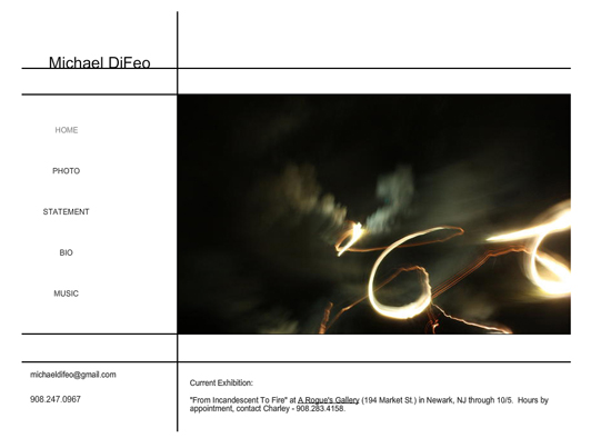
I chose a simple black and white design for my website. I think it’s a classic and clean and reminds me of the white walls of most galleries.
How did you decide which type of designer to work with, or did you design your own identity and web presence?
I’ve designed my own website. I used a web editor and a template to create it. It’s a bit simple, but it serves it’s purpose.
“66” from Pyrology on www.mikedifeo.com.
In what order did you present your company to the world? Did you start with marketing and products, or website, blog and social media?
First, I began showing work. I promoted these shows with postcards, Facebook, and email lists. I eventually created my website about a year ago. I also post to Instagram which pushes to my Facebook.
How long after the launch of your company did you start pitching in social media?
Since my first post-college show I’ve always used Facebook to promote my events.
Did you do research or study any software, take webinars, teleclasses, before approaching any area of your marketing or web presence?
Not really, I just figure it out as I go.
Do you advertise online using Google, Facebook or on other company sites? Are they effective?
I promote myself on Facebook, I feel like it’s pretty effective and I like that it’s free.
Which social media site do you spend the most time on and how does it help marketing your business?
I spend the most time on Facebook. It’s a great way to find out about calls for work, to promote exhibitions, and to get my work in front of people. I’ve got a couple people interested in buying work that they saw on FB posts.
Do you belong to community sharing websites? Which ones and how effective are they in building your audience? What are the best features that help your business?
I have a page on an art community site called yourarthere.net. While it was a good starter web site for me I haven’t seen any obvious benefits from being a member. I think their best features were a clean looking layout and their public calendar I could post events to.
http://yourarthere.net/community/member/michael-difeo
When you printed your products, packaging, business cards and other print marketing did you choose an online printer or visit a local vendor?
I’ve used a large online printer for my business cards and for postcards. It was economical and their downloadable templates made designing them quite easy.
Have you ever used “green” technology in printing, using FSC certified papers or recycled paper and if not, how likely are you at trying this on a next project?
I haven’t used green printing options in the past. My likelihood of using this type of service really depends on it’s price. I do however use reclaimed wood to build frames for my current series.
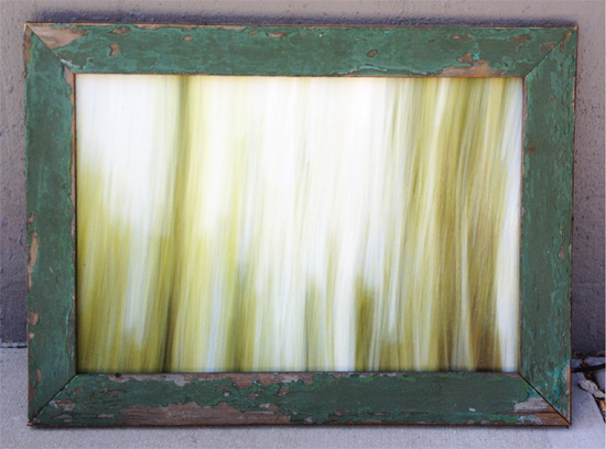
“Through the Trees #2” by Michael DiFeo.
What is coming up in the year or two we should watch for?
I’m working on a series of camera paintings shot in forests called “Through the Trees.” It’s a lot more Zen and contemplative then my previous work. This work explores the concept of Komorebi, a Japanese word that roughly translates to “the scene produced by the interplay between the light and the leaves.” In this work I attempt to reproduce the serene pleasure of gazing up at trees dancing in the wind before an obscured sky.
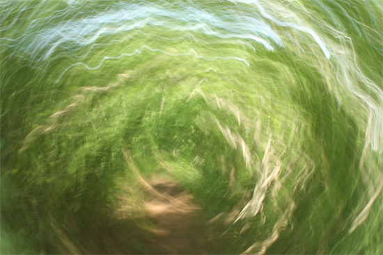
“Through the Trees” #1 by Michael DiFeo
Is there anything you haven’t yet tackled, but will want to do soon?
I’d like to show some representational or more traditional photography. I love showing abstract art, but would be nice to mix it up a bit.
To learn more about Michael DiFeo visit the links below:
https://www.facebook.com/michaeldifeo
https://soundcloud.com/michael-difeo