Newman’s Own Have Rebranded Their Packaging
A bit of history before we get into the rebranding of the Newman’s Own packaging.
I have been a big fan of the Newman’s Own product line and not because the last name is the same, but because in addition to creating great products, they donate proceeds to charity. For so many years and I’ve lost count, I have been buying these fabulous “Salt & Pepper Pretzels” (hot but not too hot) and now with the repackaging it seems they have discontinued making them. I have been to a bunch of different stores, Whole Foods, Garden of Eden, and the local gourmet delis, and sadly, they’re gone. I’ll never understand why a company does this. I have written to the company twice so far asking about them, and no answer.
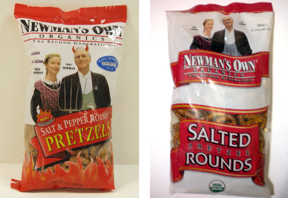
Now, let’s take a look at the old packaging next to the new packaging.
Here are the problems I see with the new packaging, pictured on the right. First, the name, “Newman’s Own” in the new version. The white with a black drop shadow letters, are squished together, practically bleeding into each other, and the word, “organics” is practically hidden. In the original version, (left) the Newman’s Own name was large black letters at the top, bigger, stronger and looking bold. Also in the old version was the blue circle about the amount of money donated to charities. Note how that is now missing on the new bag. In the old version the ribbon concept was only used once for the type of product, separating it from the product name, and now in the new version we have two ribbons (overused).
Overall I don’t think this repackaging is an improvement at all, the new bag looks plain and the emphasis seems to be placed on the wrong parts. The original design was laid out better with the product name at the top, easier to read, clearly visible and Nell and Paul Newman were placed in the middle.
What do you think? (…and if you find any of those salt and pepper pretzels anywhere, please let me know!)
- Lisa Steadman – 30 Days of Brilliance – Brand Identity Design
- New Videos – Understanding Google Analytics and What All That Data Means

