
Book Marketing: What Makes A Great Book Design?
You name the book category, I’ve done it, but when it comes to actually expressing the answer to this question, I couldn’t seem to get the words out right away. I’ve thought long and hard and I am ready to answer it now.
They say a picture is worth a thousand words and I’m sure I could show a bunch of covers that I think are terrific (see a few below). They would each have just the right “something” that makes them accomplish their goals in sensibility, reach and sales.
What it really takes to create an award winning, high selling, pull it from the shelf, (or web page) cover.
This can only be achieved by a professionally-trained graphic designer who has a complete understanding of this particular art. Conceptualizing a way to convey just a hint of what the reader will discover once they read the entire text. The cover cannot give away the answer or conclusion, only entice someone to pick it up, look it over, feel the paper, admire the images, and be convinced they want it.
These are just some of the questions to be answered before beginning.
- Has the designer read the manuscript? The cover and interior must have the look and feel necessary to be synergistic with the actual content. Every author has their own style and flair, so portraying that graphically or in artwork can only be done through insight.
- Does the author have an established brand and previously published books? Are there any graphics, logos or color palette issues that need to be addressed or included? Does the author have certain preferences already established? For example, maybe he/she only likes full bleed imagery.
- Is this the first in a series or is it a stand alone book?
- What other books have been done on this topic and were they done well or badly. They must be looked at and evaluated.
- Is there a following for the topic and who is the target market trying to be reached?
There are all types of designers and illustrators with different styles and it’s always best to match the artist with the right content. If a book was a lighthearted comedy you wouldn’t get a cover artist who was dark and serious. That wouldn’t fit. If the book was a war history nonfiction you wouldn’t put a cartoon on the cover. (I hope.) For many years I was an art director in publishing and it was a joy creating the lists of books I was given. The nonfiction and novel manuscripts had to be read and then assigned to the particular artists who I visualized as the perfect match to create that perfectly aligned, award winning piece.
Great book cover design comes from combining learned skills, marketing techniques and putting oneself in the shoes of the customer. At the same time, pleasing the publisher, editor-in-chief, book editor, marketing director, sales director, and most especially, the author.
Today, we have even more factors to consider due to e-books, audio books and selling both in-store and online. Selling from a self-publishing author’s website, the publisher’s website and online book stores like amazon.
In addition to the cover and interior needing to be visible even if reduced to a postage stamp size, there are so many more online factors. The book and author need a strong identity and web presence to build awareness and visibility for that book and the authors brand. Having a social media presence as well as booking appearances in book stores, on the radio and tv. Creating videos introducing the content or short clips of readings which can be searched on YouTube as well be shared throughout the web.
A book can be a brand on its own or the author can choose to build their own brand and the book is just one part of that. Here’s an author checklist to review for your branding, book and brand visibility.
________________________________________________________
I asked a few colleagues with extensive book design experience what they thought made a great book and here are their responses:
Todd Radom: “…I’ve always considered the best covers as miniature posters, with the proper balance of visuals, depending upon the title—competitive and commercial if need be, quiet and literate if that’s what’s needed. Crafted and visually appealing.”
Jackie Meyer: “A great cover is one that does the manuscript justice and then some. I always felt the obligation to the author and the text, to illuminate the audience and to excite the reader’s mind. To adorn someone’s library is wonderful but I think the jacket is as much a vehicle for selling. That was the original purpose. And with digital books it seems that will again be the focus. I also believe in branding as part of the equation. Readers buy authors and relate to the brand.”
Peter Thorpe: “…some art director said a cover should work tiny… meaning as a small thumb in a book of the month club print ad, or across the room in a book store. If you are in a book store, and you see a cover from 20 feet away, and it makes you want to walk over to it, well, that’s a great book cover.”
Andy Levine: “Nice paper stock. Elegant type. Quick read, glorious photo, graphic or art. An image that doesn’t tell too much of the story. A book that says, Touch me. Pick me up.”
________________________________________________________
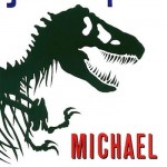
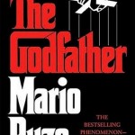
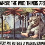
Here are a few book covers that I believe qualify as “great.”
(see this list for some more)


Here are a few of the comments from my LinkedIn Discussion: What Makes a Great Book? (Read the rest and add your own!)
Jennifer Toombs: “I would say that it entirely depends on the subject of the book, and the audience in which it is intended. A grid structure is important, as well as typography that matches the voice of the content…”
Neda Ehsani: “I am one of those people who does judge the book by the cover in someways… I look for something catchy and unusual, something that I shouldn’t understand unless I read the book. As an advertising major, I say, it needs something bad, evil or ugly against all the goods, (depends on the story of course) or it won’t stand out on the shelf and becomes just another boring book. Sometimes I buy a book and there is this greedy looking person watching at the good things around but when I read the book, I realize that was not a key character at all but made the book to stand out.”
Magda S.: “I agree with Jennifer. Novels are meant to be read in a linear fashion so readability is the key when the book is a story. However, today’s audiences do not read linearly, especially when reading a book for design sake or one for instructional reference. For the reader, accessing of the information quickly is the key. Therefore, creating a clear consistent hierarchy that leads the eye conveying the author’s intent, utilizing a combination of text, images, and (color) white space, in clear systematic codes for the reader to digest and use, enhance the readers’ experience. And of course it does not hurt to have extraordinary index and TOC (table of content). I think the cover is your icing and should be as inciting as possible.”
Christian Kunnert: “The visual form of a book should be the result of understanding its content, its purpose (whether it’s a coffee table book, a scientific book, a picture book, a reference book etc) The book is also an object of use. It has a physical presence. The combination of considered choices regarding the macro – (format, typographic grid, size of text columns, paper stock, binding, finishes, organisation of headings, captions etc) and micro-typographical aspects of a book ( typeface selection, letterforms, letterspace,, type size, type treatment for various type of content, etc) will impact on the end result, the ‘look and feel’, its appropriateness and ultimately its success with the viewer.”
Eduardo Rosado: “I wanted to add that pagination, rhythm and pace of pages is very important. A great book design takes the reader by the hand and takes them into a journey, a ride. Whether text or images, or the combination of the two, a great book design should keep a pace page by page and knows when to surprise you, when to build up a story, when to have you go back a few pages to re-read or when you need to pick that book again tand read it over.”
Begoña Lafuente Lopez: “Nowadays almost everybook is in digital format or so , then if you are planning to make a cover for a printed book you are targeting to someone who likes books as an object,not just pleasure for reading but the sentimental aproach to an object to manage in your hands and you may want to keep later as a collector, other wise you just read it in your e-book, cheaper with no space in your house needed … I agree it has to be something eye-catching, but it can have some texture too. It could be great if you can choose the cover from several options as you make an orther in internet with just a few available of some of the options to make it very desirable.”
Samantha Hollister: “In general, something enticing & memorable… but that is true to the style, tone & genre of the book. (We’ve all seen “dishonest” movie trailers.) Richness & depth – whether texturally, typographically, photographically, or with color. Legibility & ease of access to information. Space to breathe. It’s unsettling when designers overrun every square centimeter with information. Which leads to – focus. Not all things are equal. Leave them with one dynamic, lasting impression.”
What do you think makes a great book? Please leave your comment below.
- Brand Interview: Leslie Josel – Order Out of Chaos
- SEO Visibility: Naming Your Photos and Documents Correctly