
Starbucks Repackages Their Coffee Bags Again
A while back I wrote a post commenting on Starbucks changing their coffee bag packaging to plain white bags, with just a hint of each of the flavor’s graphics. I’m sure there was a steady stream of comments, because they changed the packaging again.
This time they did it right! The bags are distinctive, showcasing those original graphics created for each flavor but in a new way. They went with metallic inks except for the logo itself which maintains the branded green color and has a spot gloss.
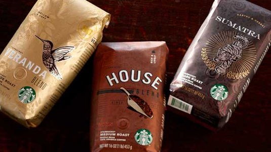
You’ll notice in the photo above, they still incorporated the “blonde, medium and dark” roast categories, so customers can familiarize themselves with their favorite flavor easier, while they maintained the originality of each bag’s design. Bravo!
Starbucks says on the new packaging: “Our goal from the beginning was to not only share our passion and pride—but to make it easier for you to navigate our coffees by understanding their special differences. So our studio designers and writers spent nine days in the tasting room. Cupping each coffee with our coffee experts and hearing the stories of how each coffee came to be. The results: each bag a unique expression of heritage, roast and flavor that’s yours to experience.”
- When Is It Time To Change Your Hosting?
- Brand Interview: Maria Murnane, Bestselling Author and Speaker
3 thoughts on “Starbucks Repackages Their Coffee Bags Again”
Leave a Reply
You must be logged in to post a comment.
Love the new packaging! Congratulations on the new designs. Great coffee!
Lynne, Yes the new designs are really well done!
Pingback: How brands can use social media to better connect with clients | Branding YOU Better! - Susan Newman