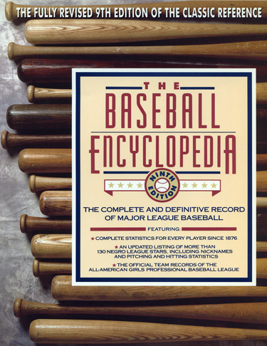
Baseball Encyclopedia: Original Book Design vs Today’s Web Only Version
A funny thing happened today… I was reminded about the way things used to be.
Many years ago I was given the task of creating a brand new look to the infamous “Baseball Encyclopedia.” In my mind I wanted to move far away from the old versions that were just blue, red or green and do something fresh and exciting. As an art director at the old Macmillan, I conceptualized the line-up of bats to be displayed and engaged the photographer, Jim Cornfield to shoot the image. Then I decided on Todd Radom, who’s iconic baseball logos I’d admired for many years, to create the typography.
In showing the “comp”of the new cover to the publisher, he was thrilled and scared at the same time. Would the old fans recognize it and buy it, or would they walk past it in the stores? He was on the phone right away, getting sales and marketing into the room to discuss this new look. I sat on the couch and listened in for the next 20-30 minutes. Round and round they went until it was decided, the cover was great and they were ready to stand behind it. So, then I called the photographer and told him, now I want a shot of baseballs for the back and so we had it.
I remember Todd telling me one time he was walking past a bookstore and seeing a whole wall of the books! I wish I had a photo of that now. That book jacket was done in 1993.
Today someone emailed me to tell me they thought they saw the book in a movie they were watching. So Todd and I started discussing it today and after looking on the web, it looks like the last edition was published in 1996 and had a CD included. There has not been a new edition since then? The details are only on a baseball stats website now, and by the look of it, all about stats, there’s no creative design here.
Todd Radom: “To me it’s a different side of the brain thing. This probably applies to most data-driven folks, right? Although students of baseball have a defined appreciation for the visual history of the game.”
So, should we assume that those “geeks” that are just interested in stats, don’t care what web design looks like? What do you think?
- Lois Bender – Gardenspirits NY Branding and Web Design
- Gender Specific TV Commercials During Justified on FX – Reaching the Right Target Audience is the Key!
2 thoughts on “Baseball Encyclopedia: Original Book Design vs Today’s Web Only Version”
Leave a Reply
You must be logged in to post a comment.


Web design is such a subjective thing, although it’s so much easier to measure how popular the design of a particular page is with Google Analytics and the like. While there’s an aesthetic element to a book cover, the same is true of a website design. At the end of the day, for better or worse, money talks. If it sells, they’re going to keep doing it
Thanks Garry, I do feel that what Google Analytics tells me is so important when it comes to websites, and even if the data shows tons of traffic and engagement, there’s no reason the site can’t be branded in alignment so it’s a pleasing experience at the same time. Don’t you think? – Susan