Skimping on Brand Packages Tells Us Something About Your Company
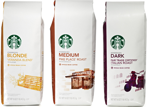
In the last few months I have been thinking quite a bit about the new Starbucks coffee bag packaging designs. When they first changed the designs, I couldn’t find the Sumatra bag and wondered if I was buying the right one. The more I looked at them over the weeks, the more it started to bother me that they had “dumbed down” the packaging.
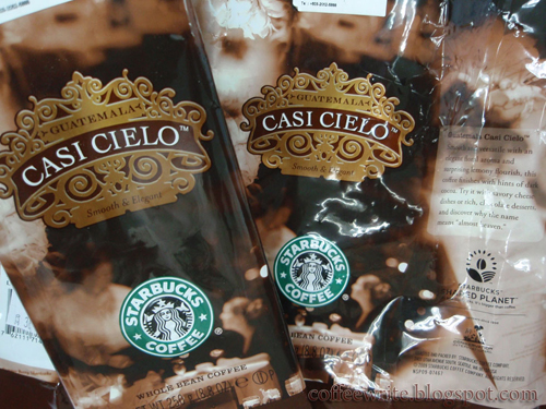
Before, each type of roast had such a beautiful, interesting bag design, and they were quite unique. Even the Christmas blend was a welcome sight when it would appear at holiday time, or if they introduced a special roast from some exotic land. My favorite blend and packaging was Casi Cielo!
So these new bags have told me something about how Starbucks the company feels about their brand. Now that all the bags look the same except for the type of roast (the typographic part and perhaps a slight graphic that is almost invisible), that also tells me something about them. They changed their logo last year and perhaps chose not to spend the money to adjust all the different packages, and just went with the easier, cost effective way. Now, I can’t be sure that they didn’t want to spend the money, it’s just what I think when I see these new plain bags. With all the stores and all the traffic, they couldn’t afford to create new bags?
Another way of thinking might be that they wanted to solidify their brand even more and a way to do that is with repackaging all the coffee bags. But does Starbucks need a stronger brand? Who doesn’t know their brand and logo?
And yet a third option might be environmental. It’s possible that they close an environmentally friendly packaging choice? Less ink, better material?
I came across this article while looking for Starbucks packaging images for this post, and read what the Senior Designer at Starbucks says about the new packaging.
“The original coffee bag art lives on in updated icons that not only make it easy to navigate among the other bags, but are direct descendants of some of the original stamp art seen on our bags for many years. Yes, the Sumatra tiger is still a tiger and the smiling sun on Breakfast Blend is still the same. But if you look closely at these coffee icons, you see echoes of the past versions in each of them,” says Jeff Wilkson, Senior Designer at Starbucks Coffee, on the company’s blog.
____________
Dunkin Donuts, has always had their coffee bag packaging with the same designs, so I’m not expecting anything more than what I have already seen and purchased. Their coffee is just fine, but it just isn’t the flavor I like. Just not strong enough for my taste.
____________
The reason I bring this up is to emphasize that every step in branding and design a company takes, is noticed and commented on by customers and bloggers. Whatever your motive, be prepared for how it will be received.
2 thoughts on “Skimping on Brand Packages Tells Us Something About Your Company”
Leave a Reply
You must be logged in to post a comment.


Pingback: What Brand Disappointment Looks Like | Branding YOU Better!
Pingback: Starbucks Repackages Their Coffee Bags Again | Branding YOU Better!