Is your brand identity working?
Branding is crucial for every business and must be 100% right.
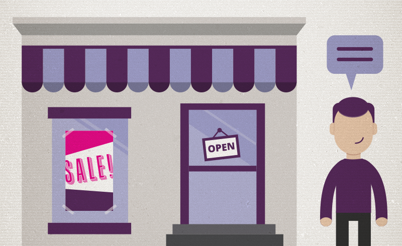
There’s a restaurant nearby that has an icon alongside their name which led me to believe they served a particular type of food. Year after year, it never occurred to me to go inside and look at their menu.
On a recent Sunday summer evening, we’re back in Jersey City Heights and it’s too late to cook, so we’re discussing ordering in from a local restaurant and which one.
We finally looked at the menu of the restaurant mentioned above and were shocked to find out that they served a full range of foods. So, we selected a few things to have delivered and the food was excellent. How many years did they miss out on gaining me as a customer?
This made me think… how many other people walk right by when they see the branding outside, which I feel is misrepresenting what’s inside. I will surely talk with them about it.
Artwork from http://socialflow.com
How to Know If Your Branding Is Right?
- The Wordmark (typographic name) must be readable and the font must match the style and mission of the company. (Example: A weight loss business should not use a very wide or very bold font, but rather something thinner, taller, attractive and friendly.
- The icon should either be abstract if the business is hard to describe, or super specific to target the right audience. (Example: If you sell shoes, a shoe icon will be all right, but if you also sell handbags, probably not.)
- The color should be carefully thought out. It’s the job of an experienced designer to know which colors go with different businesses but especially how and where they are used and with the fonts. (Example: Many financial businesses usually want to use navy blue, dark cyan, grey, or black… very conservative colors… but sometimes a warm plum, burnt orange or even a rose color could be paired with a brown, grey or black and achieve the right feeling. Of course the right colors are combined with the right fonts.)
- The logo should be created in multiple variations and sizes. . (Example: High resolution and a CMYK tiff or .eps for print marketing and jpg for web usage. Be sure to create a gray scale version also.) I search on Google for logos all the time and it can be difficult to find a large, high resolution version. If you want others to share and talk about your business, make it easier for them, not harder. Make sure you are creating the right size and resolution for the social media profile pages also.
Most important is to know that your branding is attracting your exact target audience. A great way to figure this out is to make two lists. On the first list you’ll put the characteristics of your current clients and on the second list those of your dream clients. See what matches and what doesn’t.
If you are not reaching those you want as new clients, it may be time to really look at your branding, web presence and the branding on the outside of your brick and mortar store.
- Create the Job You Want and Then Be the One Who Does It
- How brands can use social media to better connect with clients
One thought on “Is your brand identity working?”
Leave a Reply
You must be logged in to post a comment.
Pingback: How brands can use social media to better connect with clients | Branding YOU Better! - Susan Newman